m1 - Diagramming Design Precedent

Case Study: "Bad Hair Pavilion"
" The precedent study for this module, Bad Hair Pavilion, is chosen from a series of experimental pavilions designed and built by Intermediate Unit 2 students from Architectural Association over 2006-2011. "Bad Hair Pavilion" was temporally constructed in 2007, the design was led by Margaret Dewhurst, Angie Bessho, Selina Bolton and 9 other members from the same project group.
- From "Making Pavilions", edited by Martin Self & Charles Walker "

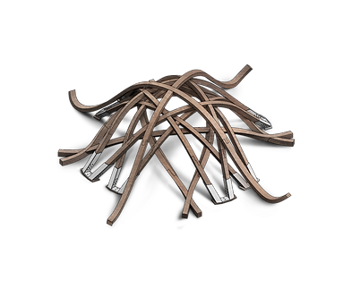
Pavilion Components offroad, standby for construction, 2007

Built Bad Hair Pavilion, 2007
Modelling the Pavilion
The modelling process of the pavilion could be broke into two stages, 1, Tracing & Extruding each layers' component, 2, Assembly and adjusting layers when laid together.

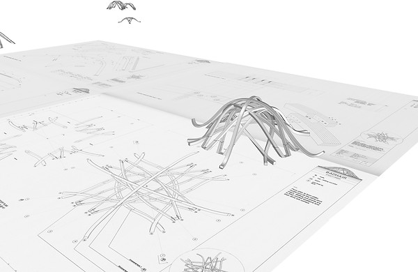
Tracing and extruding layer component along original plan

Stage 1. "Tracing, Extruding & Sweep 1"
The first stage for general modelling is to build up the basic component to structure each layer of arc-shaped beams. The model in total contains 4 layers of beams, and 2 layers of them remain in the same shape, but in different sizes. All layers have one to two basic components, which is then duplicated and rotated by 90 degrees, then together forms the layer.
All beams are also processed with angled shifting and twisting at certain degrees. Layer 2 & 3 are purely shifted in angle and could be processed primarily by self-rotation. While it’s a bit more complicated to rest layers since they all got curved a bit along its vertical axis at both ends of beam. Sweep 1 command was used for that part of modelling. Two ends’ cross-section is drawn with polyline in advance, the command asks for a course line to link both ends, results in the smoothly modelled arc beam.
Using Sweep 1 for shifting rotations along beams
Stage 2. “Rotating, Overlap and Adjustment”
After building up each layer, the second stage aims to rotate every layer with close accuracy to match the original given shape in top view plan. After the adjustment, the layers are placed based on the ground level along the same vertical axis. Additional slight adjustments occur during this stage.
Other detail modelling got constructed later on, mainly on the steel-plating bracing and screws on the end footing of Layer 2 & 3 beam sets.

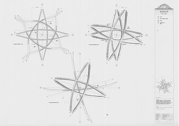
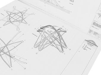
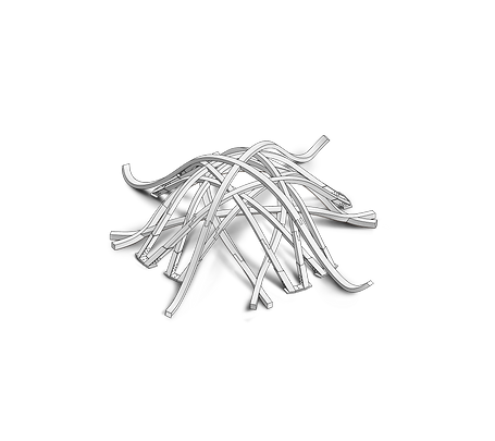
Adjusting exterior shape from top view of original plan
Adjusted Layer 2&3 model seen from Perspective view
Stage 3. “Manual Rendering & Revising”
The final exported isometric is settled at South-East for the best angle to show the primary pedestrian threshold. The exported image is imported into Photoshop, overlaid with pre-rendered shadow then multiply blended with timber texture.
Circulation diagram got specifically revised after discussion from the second-week studio. It’s been pointed out that since the physical threshold remains unclearly defined in this case, it would be better to consider the main purposes of utilizing the structure, and brings out the major circulation traces without arrows labelled, so it will better displays the mass trend of circulation.
Before Manual Rendering
After Manual Rendering
Circulation Diagram Analysis
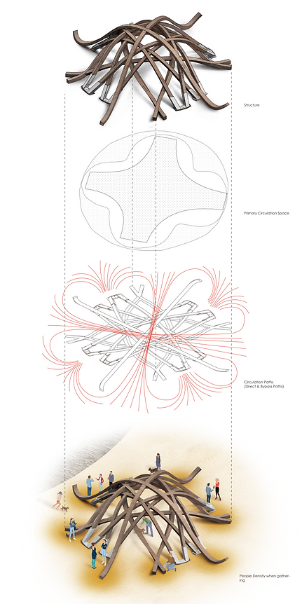
The final rendered Isometric viewed from South-East, lines up with following figures.
Internal circulation space (Middle Cross-shaped), where people go through the interior for crossing shortest length, or stay, seeking for private space and enjoy the aesthetic shadow created by light thresholds.
Circulation presented with mass trends walking traces, the traces mainly suggest two types of mainstream movements: First is to use the interior space, the original designed private space area as the public space to walk across pavilion in the shortest distance, which is very special as it tends to set opposite functioning to typical interior space. The second trend is to gathering towards four beams extended "Sitting Area", to use the exterior space as new private space.
External circulation space (Ring-shaped surrounding), where people mainly go for the flat extended beam endings, which is considered as a sitting area and another private space.
Pedestrian Density Diagram for gathering spaces. Another diagram which suggests the same idea of an opposite designed functional space of public and private, that people actually are more likely to gather to exterior space and use it as private space.
The circulation analysis only focuses on the mainstream part of all the pedestrian, the adults. Originally children movements were considered in circulation formation as well. This would mean a large amount of un-predicted circulation course lines that interact with the pavilion in too random forms. There would be dozens of circulation that go through single or multiple secondary thresholds as kids loving chasing and running around., or could be circulation lines that no more stay in a two-dimensional surface as the design provides great convenience for climbing up the pavilion.
On the other side, the unpredicted mass-circulation bought the discussion back to the origin of the design, when enough buffer is left in design from its original functional use (Providing private space & transition from public to private). The unclear definition of the pavilion appearance boosts more possibilities of interaction to its designed users, the mass people. It meets that height where users also take part in the design when they using their instinct and imagination redefining the purpose of the pavilion.
Besides, it's barely to see a kid in AA school...
Threshold Diagram Analysis
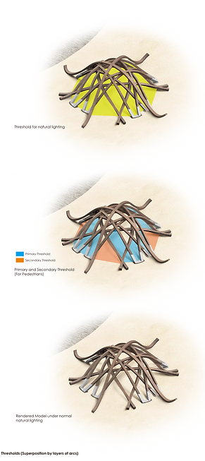
The pedestrian threshold design for this pavilion is very unlike to typical architecture threshold design, which has a clear definition of where the physical entrance is located. Instead, the physical threshold location for pedestrians, in this case, is highly independent and relied on willings and instinct of mass people. They could instinctively consider the largest four openings as the entrance, but theoretically, they can also enter the interior through some of the smaller openings aside. Consider there are no additional guides on the ground like a pre-set lane, and it's a unique appearance like installation art, the design deliberately blurred the definition of a fixed pedestrian threshold, thus people are fully encouraged to explore and interact to the pavilion with their own imaginations and willingnesses.
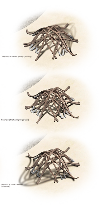
Meanwhile, the idea of creating pavilion with simple arc overlapping leads to great lighting design to the interior space. The light threshold responded to the different sized openings done by arc beam segmentations, re-assembly the natural light and leave interesting shadow effect on the ground of interior space. The design which preserves large numbers of opening also ensures consistency of natural lighting on all sides of the pavilion along with all daytime, so people don't have to casually change their spots for private space due to changes of natural light location.
Indication to Pedestrian & light threshold
The effect created by light threshold design along three timepoints of a day
Reflection on the module
Module 1 on the primary technical level helps me review the Rhino modelling, not only about commands on specific modelling scenarios but also an analysis skill to disintegrate the mass model into single components, and the ability to plan modelling steps. It's important to read and understand the design logic from the original given plans, elevations and sections images, and to duplicate them with full understanding on most of the details from the original design.
